AH HA! Studios
Branding
Illustration
Product Design
Sketches
Early exploration on what the visual identity would look like and what it would include.


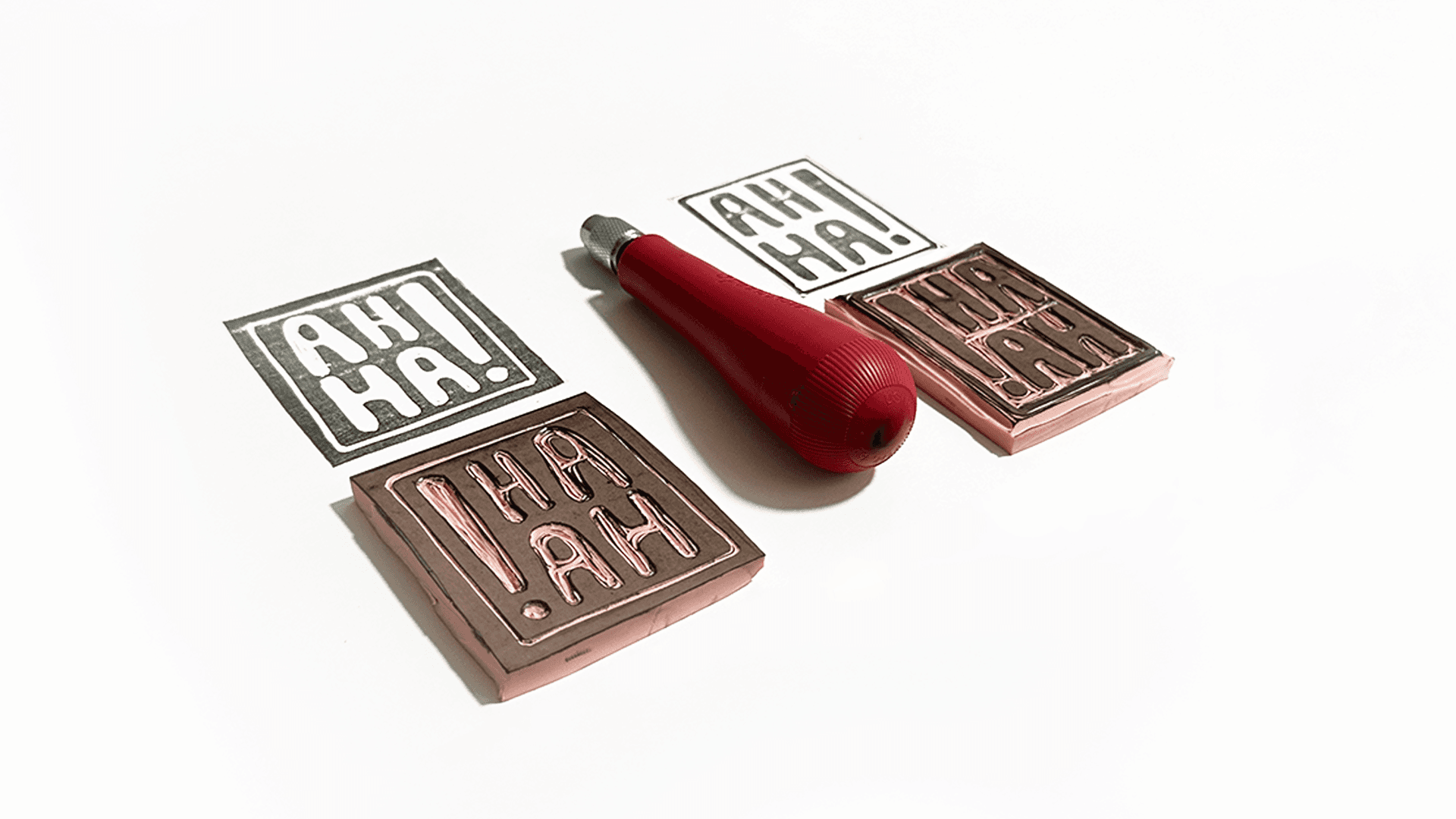
Stamp Exploration
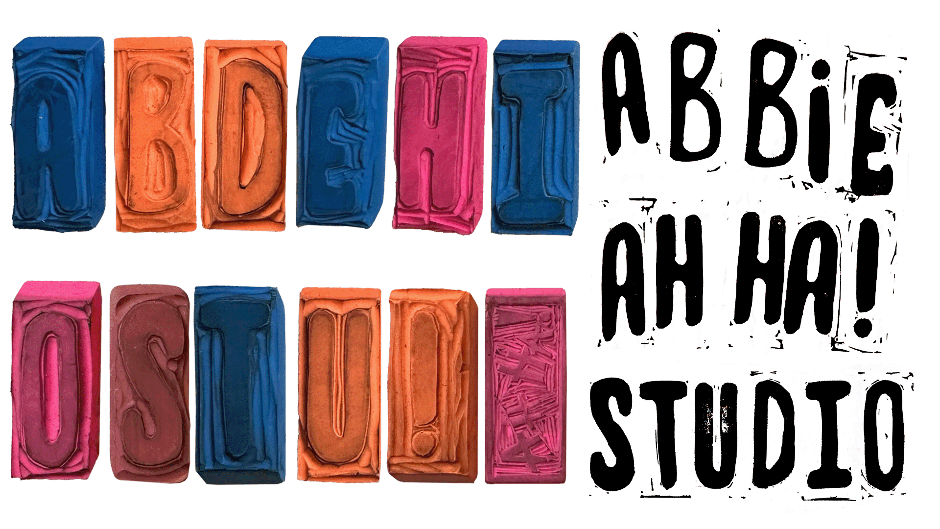
I began exploring all the possible forms that could be created via custom carved stamps. I loved all the imperfections that came with linocut and how that could add personality to the branding.

Logo
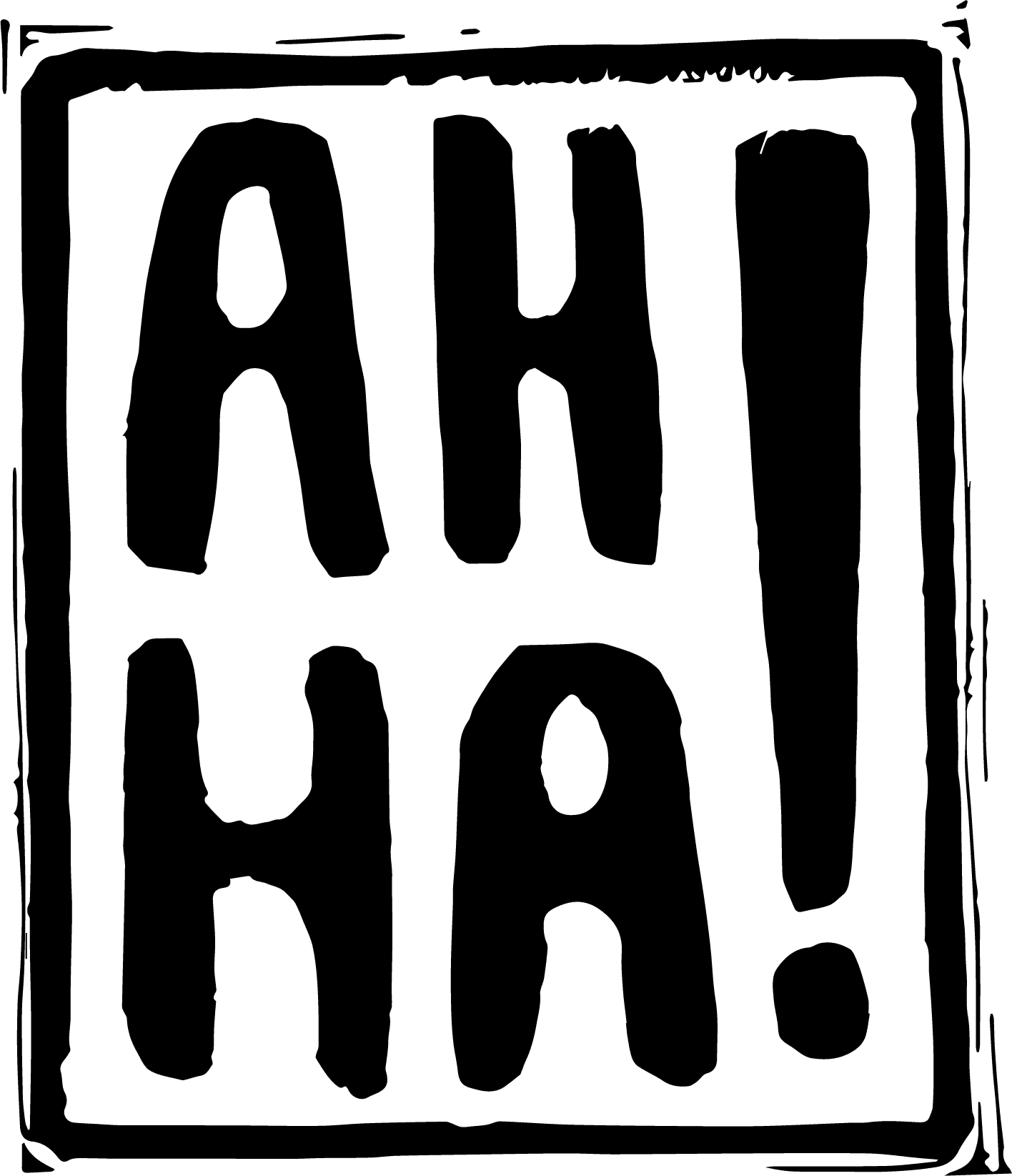
The final logo was created by cleaning up one of the stamps created in the exploration stage. By refining the stamp, I could create a logo with multiple applications while still keeping some of the playfulness and imperfections of the stamp.

Logo Variations
Logo variations that include additional text and an inverted color scheme.




Logomark Object Prototype
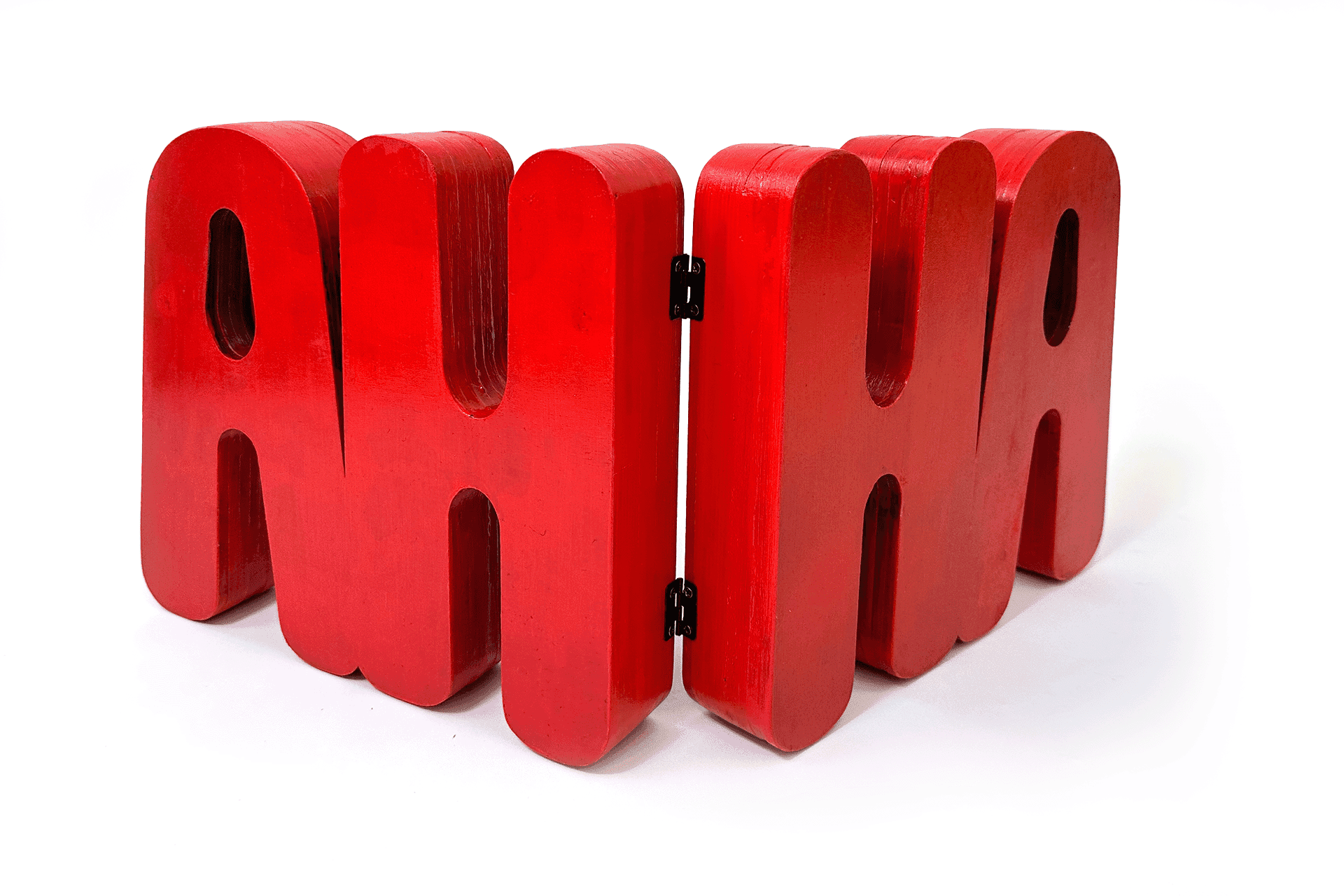
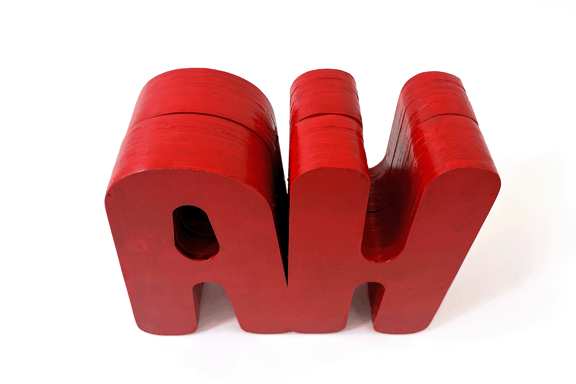
For a physical object, I wanted something that could convey the spirit of AH HA! Studios while also harkening back to its roots in stamps. The solution was a custom box in the shape of “AH HA”. Not only are you able to store items in the container, you are also able to display the box from various angles while still keeping the branding due to “AH HA” being a palindrome.
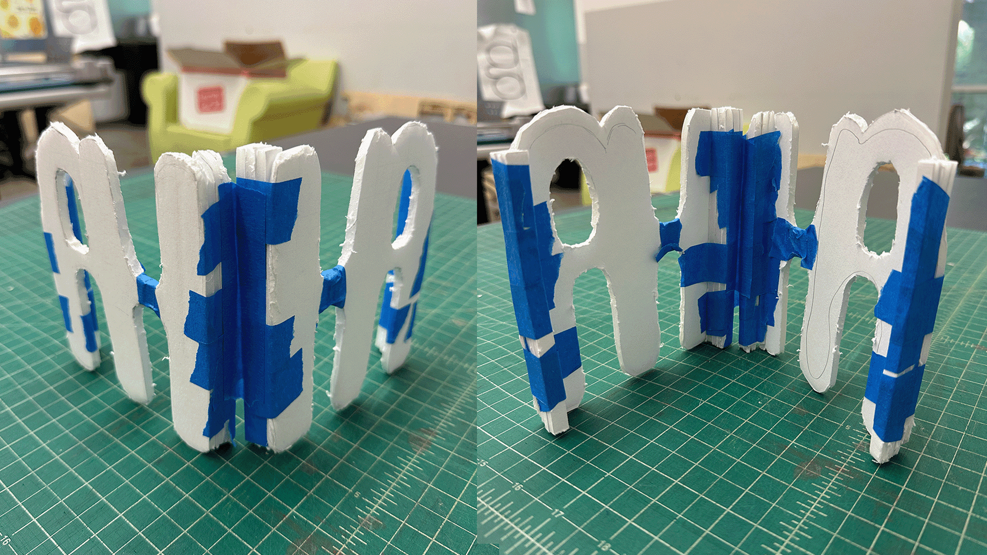
Multiple early prototypes were created to figure out how the final box would be constructed. The final solution was to create thin layers of the shapes needed and glue them on top of each other to build the walls. This enabled me to have a sturdy box with wood that curves.



Final Box Prototype
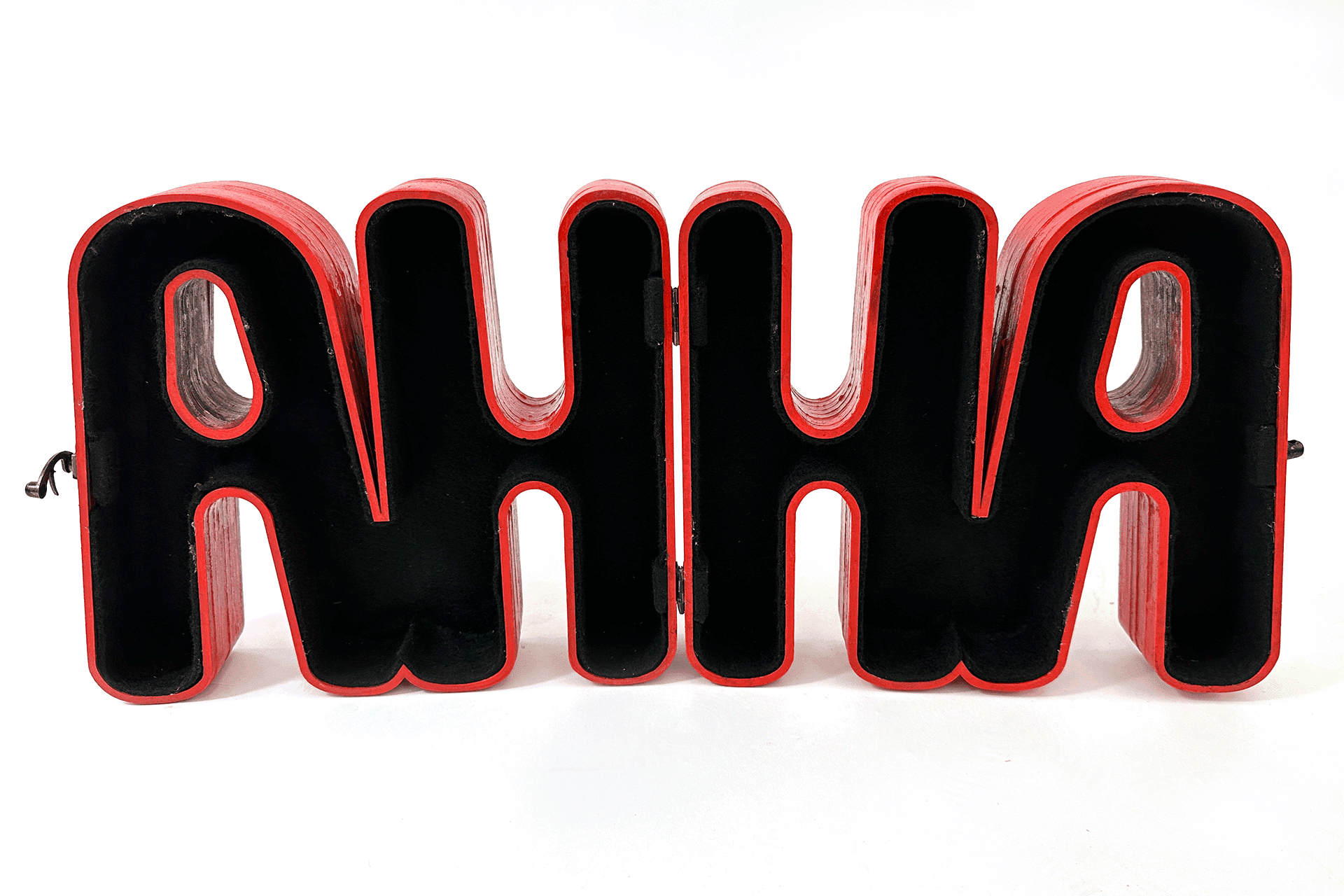
The final box was created by layering custom laser cut pieces of wood on top of each other to make the form. Each layer was cut from 11.8 x 11.8 x 1/4 Inch basswood sheets. The box was painted using spray and acrylic paint. The felt interior helps to unify the piece while also kidding residual paint and glue left over from the construction process. The box is connected by two small hinges with a clasp in the front.
