Paradox
Typeface Design
Typography
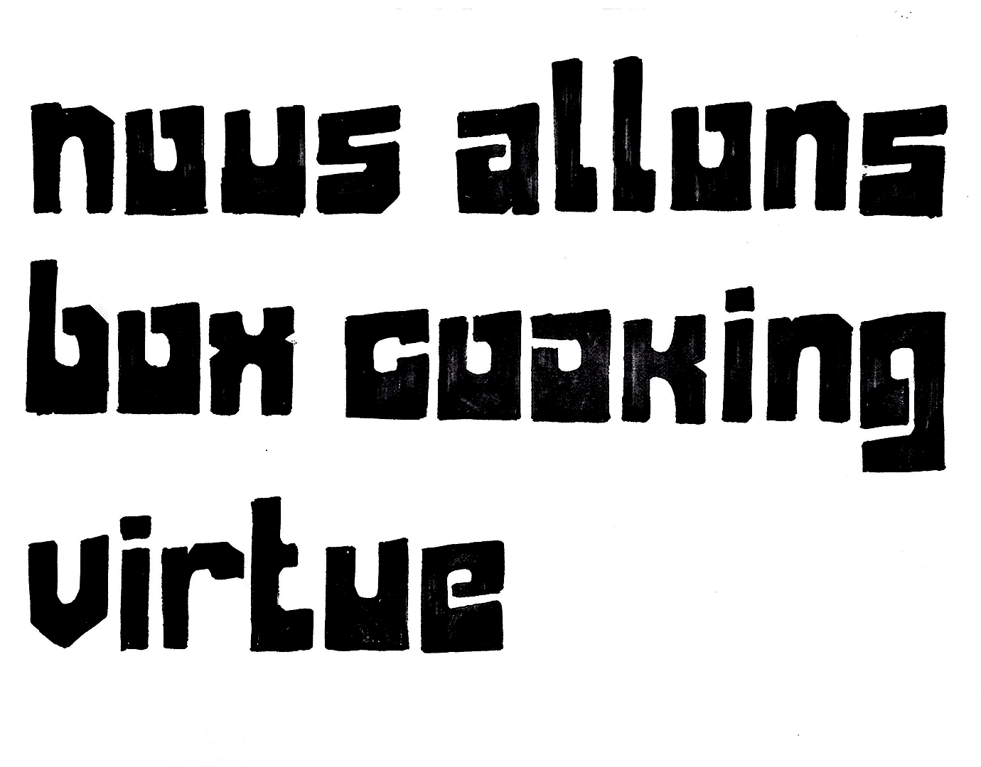
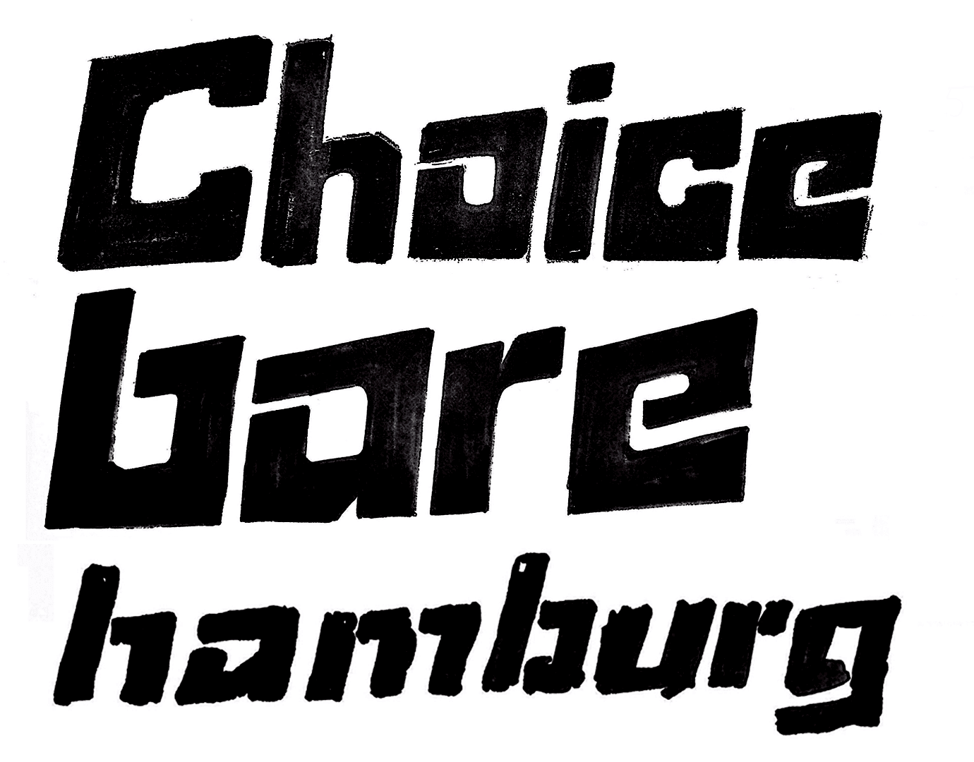
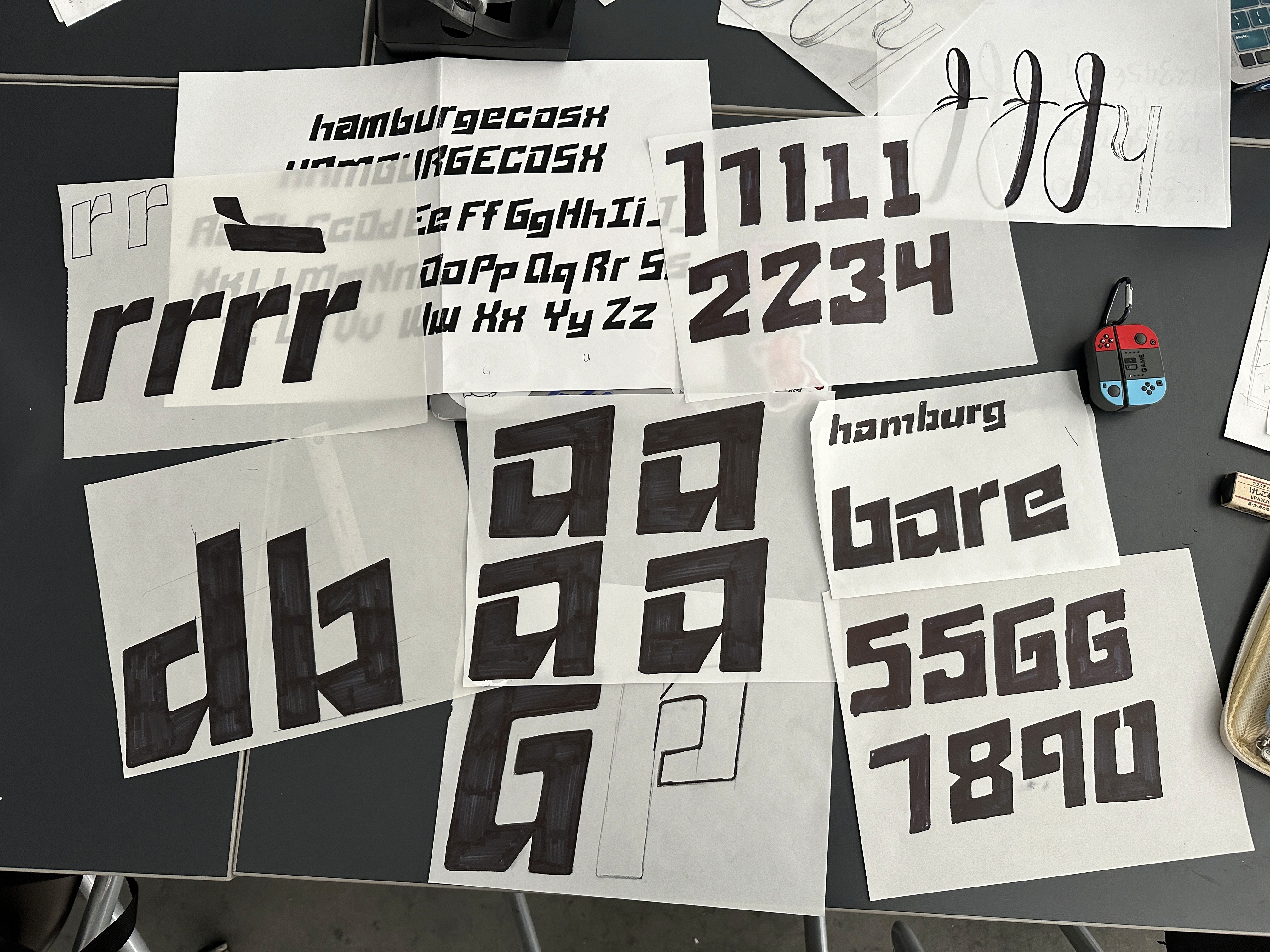
Paradox is a geometric sans serif display typeface created from the ground up. The typeface takes inspiration from retro futurism art, mid century modern design, and retro tech from the 80s. The curved corners and slanted letters all come together on a grid system to create interesting and dynamic letterforms.
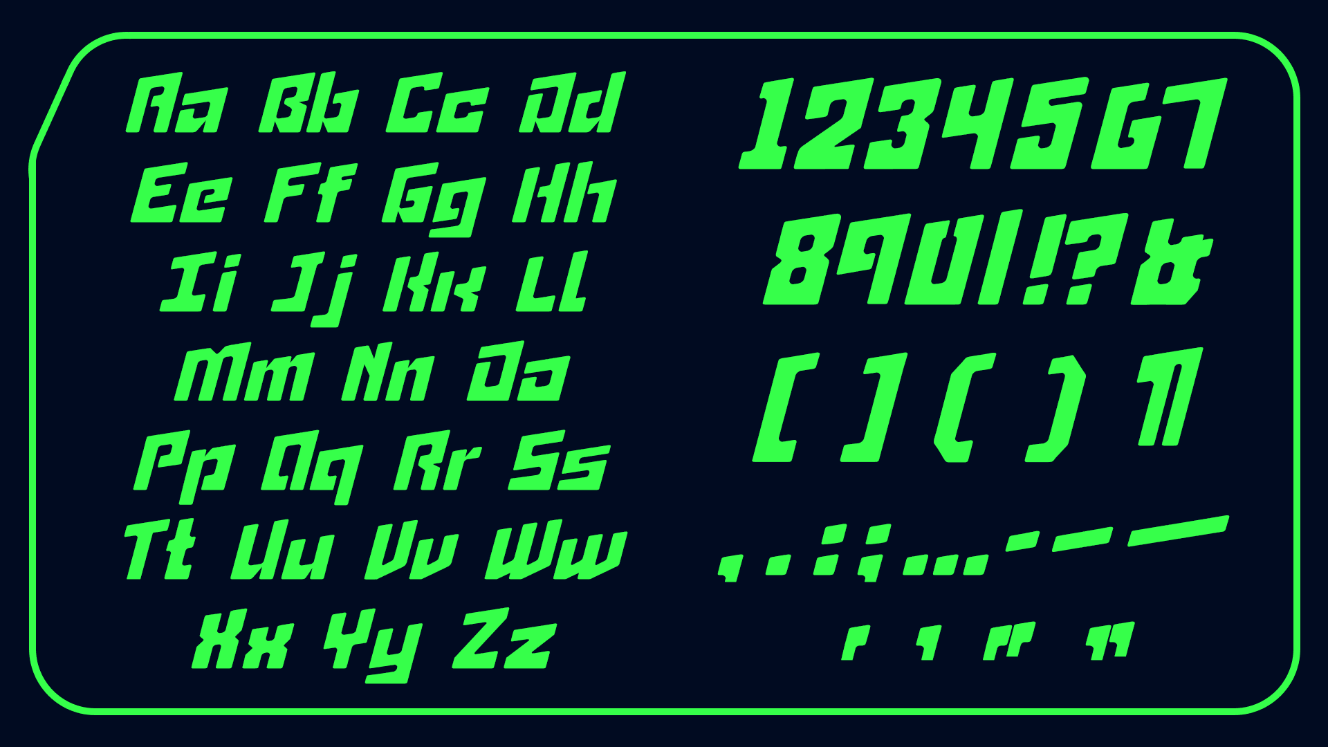
Paradox in Progress
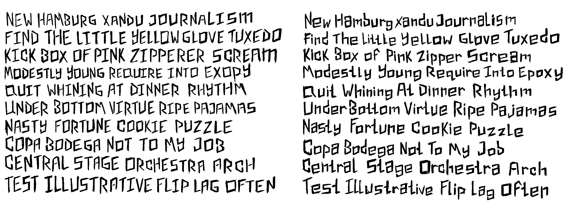
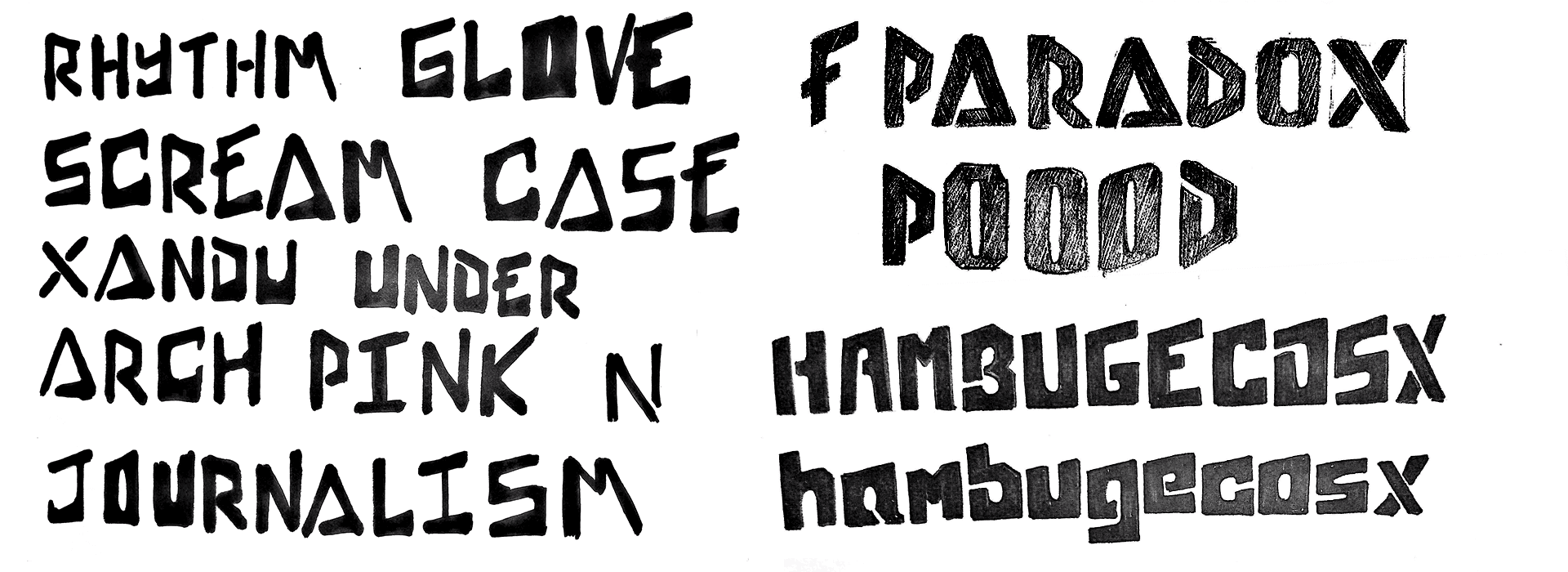
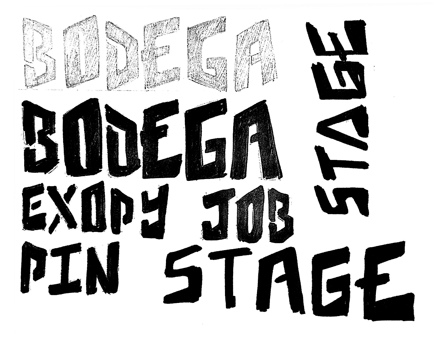
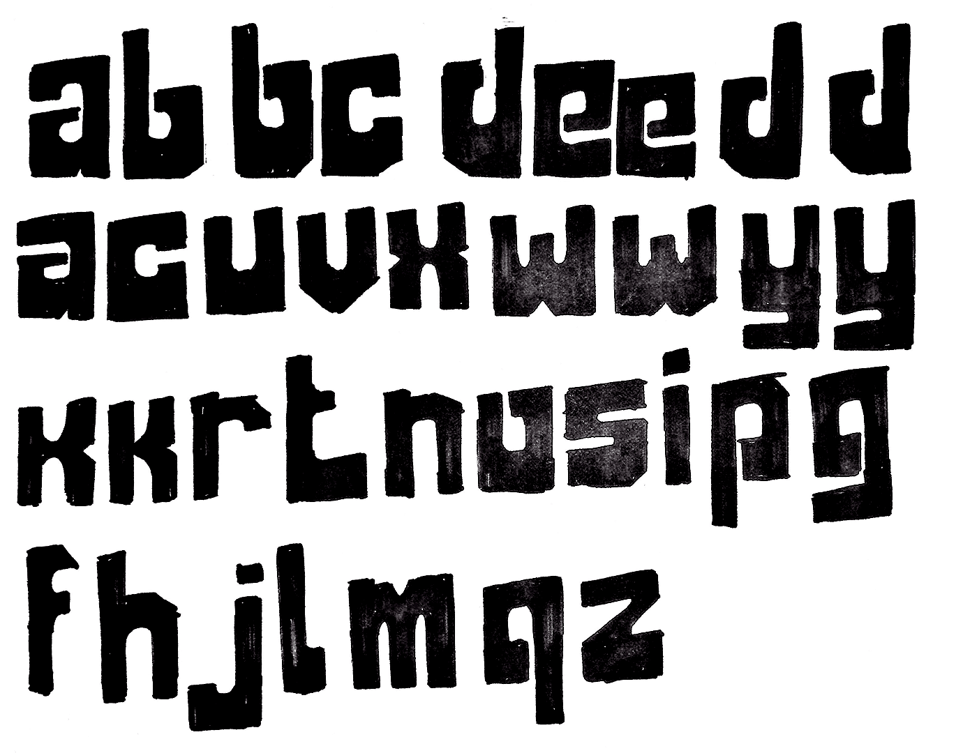
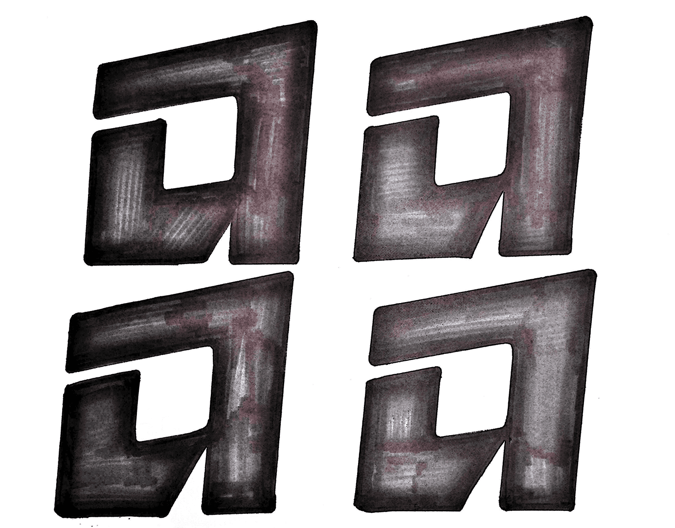
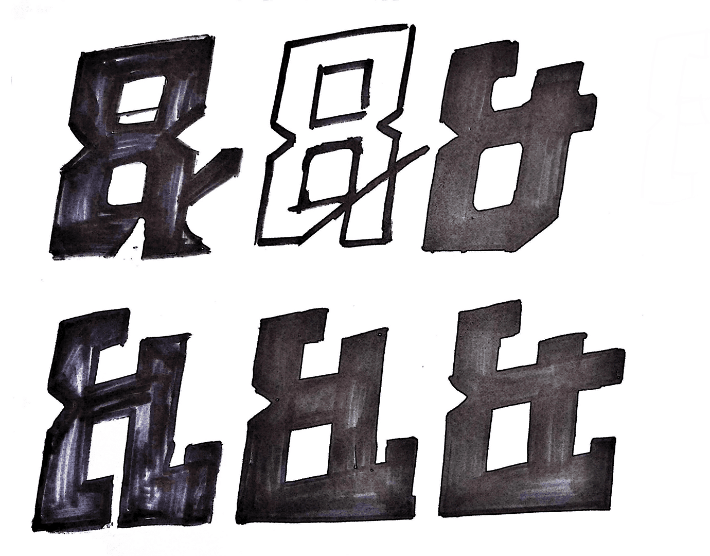
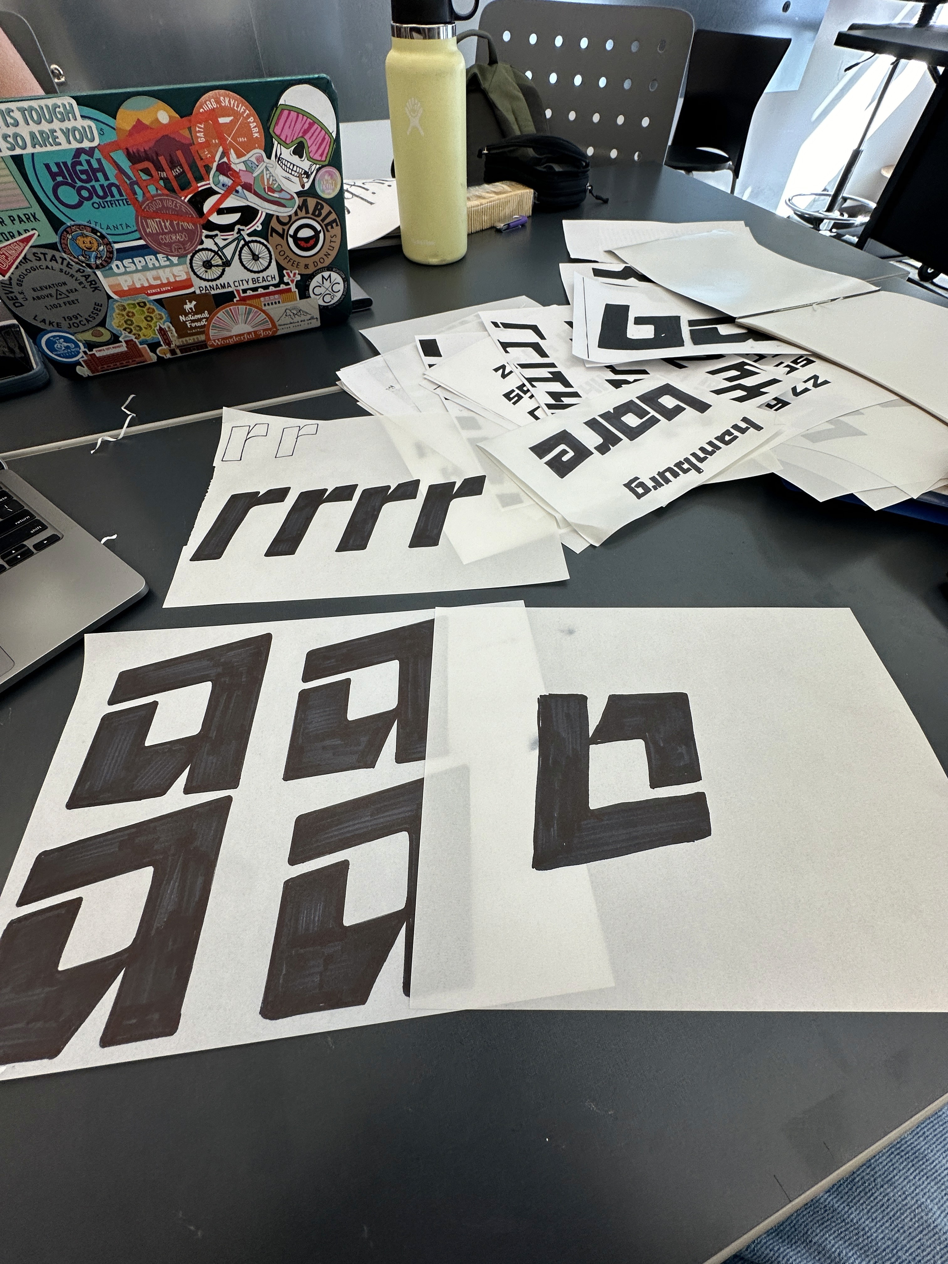
Paradox was created over the span of one semester so it went through many iterations. I was primarily focused on how to create unique letterforms while still being legible.
